Prodigy Software
Redesigning Prodigy platform that connects consumers and dealerships for a better car buying experience that saves 3-5 hours of consumers time.

Problem

Our solution
Our approach

Founded in 2015 Prodigy launched the first-ever End-to-End sales platform for car dealerships. Buying cars online seems simple, but what if you could do it as quickly and easily at a dealership, and still get a test drive? Prodigy wants to give auto dealerships a toolset to modernize selling cars on the lot.
Major elements of the Prodigy platform include “predictive inventory filters” to narrow the inventory search quickly based on customer preferences, mobile driver’s license scanning to speed up moving from the greeting to a test drive, and access to OEM specifications and third party info sites such as Edmunds.com and Kelly Blue Book to answer questions on the spot.

The challenge
Over $1.1 trillion dollars of cars are sold each year in the US and yet it's consistently ranked the #1 worst consumer experience in America, with less than 1% of buyers satisfied with the current experience. Because car buying can be a time-consuming, stressful experience. Our challenge is to lower the stress of shopping for a car.
Car buying habits are changing — you have customers visiting 1.6 dealerships down from 6 dealerships. Those customers are doing an average of 18 hours to 20 hours of research before going in. When they get there they’ve done so much research chances are they know more than the salesperson does. The consumer has changed significantly over the last 5-10 years, yet the dealership hasn’t changed much.
Market research
90% of Car Shoppers Prefer a Dealership Where They Can Start the Buying Process Online
This is according to a new survey released by CDK Global. According to the report, “New research from CDK Global found that car shoppers are willing and likely to start the car buying process online. In a recent survey, CDK found that nearly 70% of shoppers expected to find the ability to configure a payment on a dealership website, and 83% indicated that online buying technology would help them narrow down their vehicle choice and determine what is affordable.”
Consumers today are increasingly choosing brands that offer the best customer experience. And when it comes to choosing a dealership, consumers prefer one that offers the ability to start the car buying process online. The CDK Global research study also found that among those same consumers, almost 60% felt more comfortable starting this process on a dealer’s website compared to third-party sites.
Other key findings from the survey include:
80% of shoppers say they would likely configure a payment online.
60% said they would configure payment and provide contact information.
Of those surveyed, more than half said they would configure payment and start the credit process.
Consumers are more demanding and have more options today and dealerships must step up and cater to their customers and prospects with exceptional customer experiences. In addition to being able to start the buying process online, additional studies indicate the huge competitive advantage dealerships gain when meeting consumer expectations.
Buying experience goes digital.
Consumers desire a better virtual buying experience.

Competitive research
We took a peek at a few other on-demand companies’ to see what the current market had to offer. We focused on features we knew we would be solving for Prodigy's digital experience. Understanding what direct and indirect competitors did well and not so well would shed light on what gap in the current market Prodigy could possibly fill.

Insights:
• Let users go at their own pace and not make them feel rushed;
• Implement modern, responsive design;
• Follow standard design conventions when re-designing common features, like the Prodigy menu;
• Re-design Prodigy booking process to be more intuitive;
• Change progress bar, by asking for trade-in info first instead of personal info, otherwise possible users might be turned off;
• The flow needs to be accessible without breakpoints and needs to be consistent on all ends.
Defining target user
Initial survey.
Users spent a huge amount of time doing research. They’ve done their feature analysis and product selection and are ready to buy a car. To better understand our target users, we decided to conduct an interview and short survey with 41 participants which consisted of a few questionnaires asking for their past car buying experience. For example, we asked questions related to their device preferences on research and which devices they choose to proceed with the car buying process.
By collecting results from the survey and analyzing them, we came across these interesting points:
• 75.6% of them use desktop for the research part;
• 73.2% proceeds to buy a car on the desktop as well.
Interviews.
In order to conduct research properly and design effectively within a limited timeframe, we focused on 3 research methods - interview with 12 peoples, current platform review, and competitor analysis. From our client meeting, we knew that the conversion rate is 10% and we aim to understand why 90% of users who reached the product checkout phase in dealership e-commerce websites abandon the checkout flow.
These methods help us to answer some of the questions as following:
• Why 90% of people leave on the lead page;
• Figure out what customers are looking for (info) when they visit the dealer’s website;
• Understand why 90% of users who reached the product checkout phase in dealership E-commerce websites abandon the checkout flow;
• What info they willing to give (at what time point);
• What’s wrong with the lead page.

After gathering and recording all the information, the Remote Affinity Mapping method was used to sort and group information in order to find common themes, patterns, and pain points.

Takeaways
• The flow needs to be accessible without breakpoints and needs to be consistent on all ends
• Let users go at their own pace and not make them feel rushed
• We need to implement a modern, responsive design.
From the competitor's analysis, we decided to use the “Skip” button to give users the power to jump around steps and implement slide bars on the payment page. With User’s and Business needs in mind we concluded the following criteria:
• Vehicle detail page on hand
• Incentive for users to give personal info
• Clear CTA
• Simplify the process
The key findings obtained thus far helped us to shape two distinct User Personas representing different segments of our target audience. To stay connected to the target audience and avoid personal bias, we referred to User Personas throughout the entire product development process.

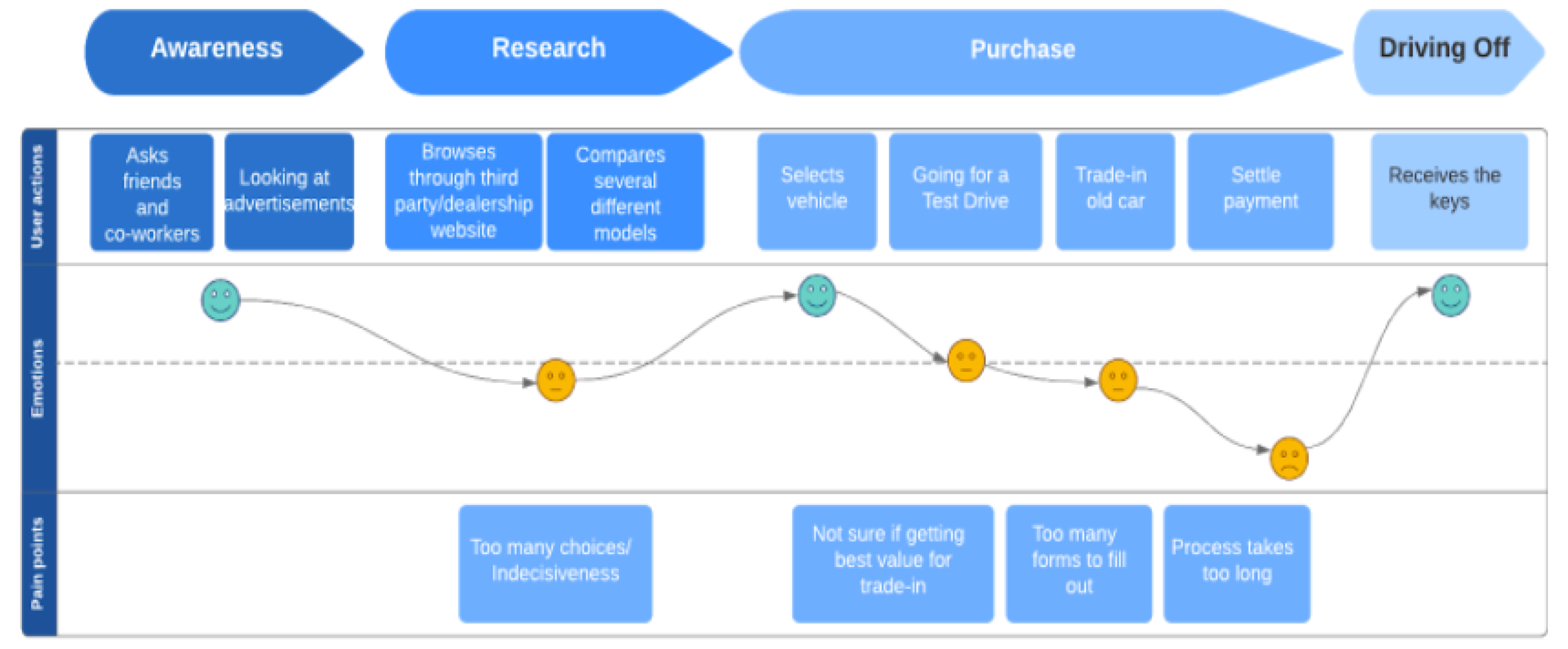
To visualize how users interact with a product we created a journey mapping to see where we can focus and create a user-centric approach.
Once we were clear with user behaviors, we outlined the project scope based on client needs and research results:
1. Create a platform that would improve user experience and, in turn, increase conversion rates.
2. Design an easy use implement modern, responsive design.
Validating user and status-quo
To better understand how people actually go through the buying process and interact with the application, we went on doing some task analysis on people who are interested in purchasing a car. The main purpose of doing task analysis was to find out what was happening during these processes to better understand their general behavior as well as getting real-time feedback. We created a list of things that we wanted our participants to follow through which started from going to a dealership website, picking a car, and following the instructions on the Prodigy application to finish the purchase in-store. At the end of the tasks, we asked several follow-up questions about their overall experience and potential improvements.
While the participants were using the Prodigy application and the application provided by the company, we observed, took notes, and facilitated the sessions closely. If they had any questions regarding certain steps or had any comments, we asked them to express them anytime they felt comfortable. Also, we asked the participants to do think-aloud while they were going through each step.
Some of the discoveries from the task analysis were very informative and we were found out that:
• Fixed sequence but various entry points are confusing
• Don’t understand what each step is for
• User reluctant to give personal info on the lead page
• Want to view exterior and interior photos
• Need clear progress indications
• Want to see the vehicle detail page first-hand and found it very useful
• Need more feedback when tasks are completed
System map
To give us a comprehensive overview of how a user might navigate through the website, we created a system map. The main goal of this was to gain a better understanding of the functionality and the breadth of the experience that our platform should be providing users.

Key features

Rapid prototyping
We created the first set of low-fidelity wireframes to show off the platform’s core functions, its basic interface elements, and content arrangement. This allowed us to quickly try out different ideas.


Evaluation
My team and I ran usability testing to identify possible areas for improvement and to evaluate the platform overall. We discovered that users were confused about where are they on the progress and if the platform has various entry points. The sequence of the progress bar changes according to the user’s entry point.
Due to shelter-in-place order, we conducted Remote Usability with 6 people. After a few background questions, the participants were asked to complete several scenario tasks using the Prodigy prototype.
While overall all the scenario tasks were completed smoothly by all participants, there were some issues that required improvement.

Final deliverables

The current lead page asks for personal info.

The user will evaluate his trade-in and in order to see the next step needs to provide personal info.

Before

After

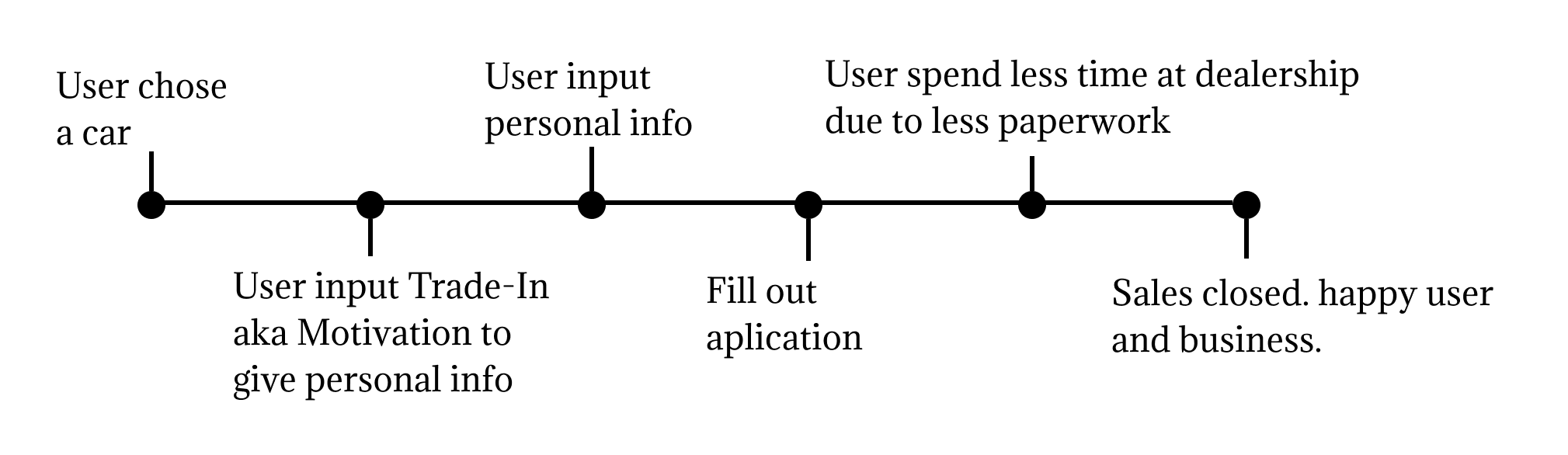
After entering trade-in value user needs to input personal info
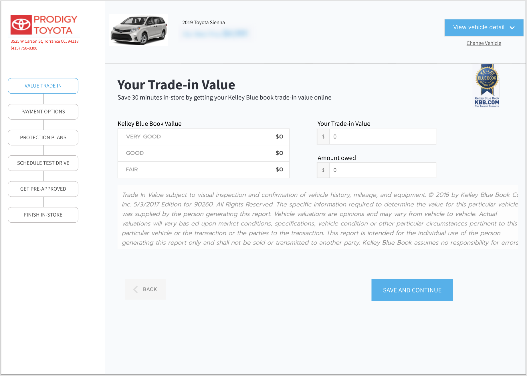
And then see the value

Payment page before

After
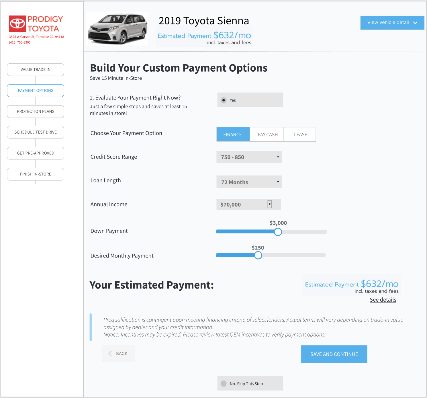
Users can either choose payment now or skip it.

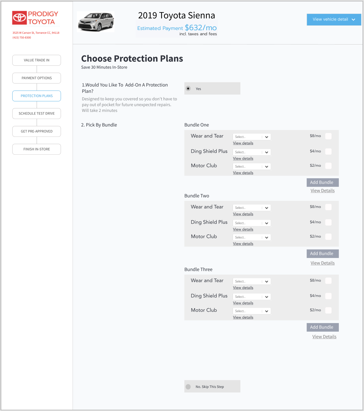
Protection Plans page before

After

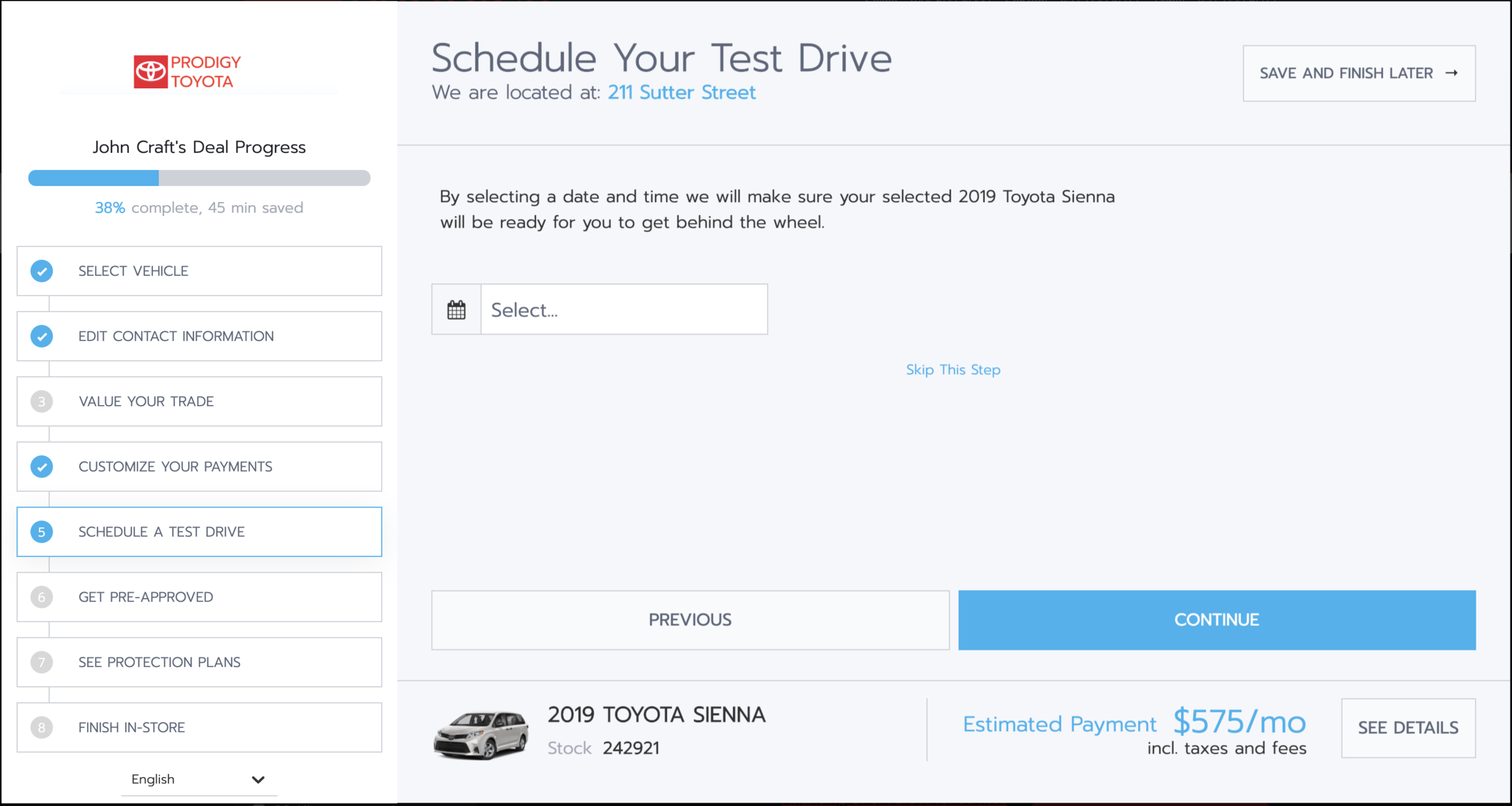
Schedule Test Drive page before
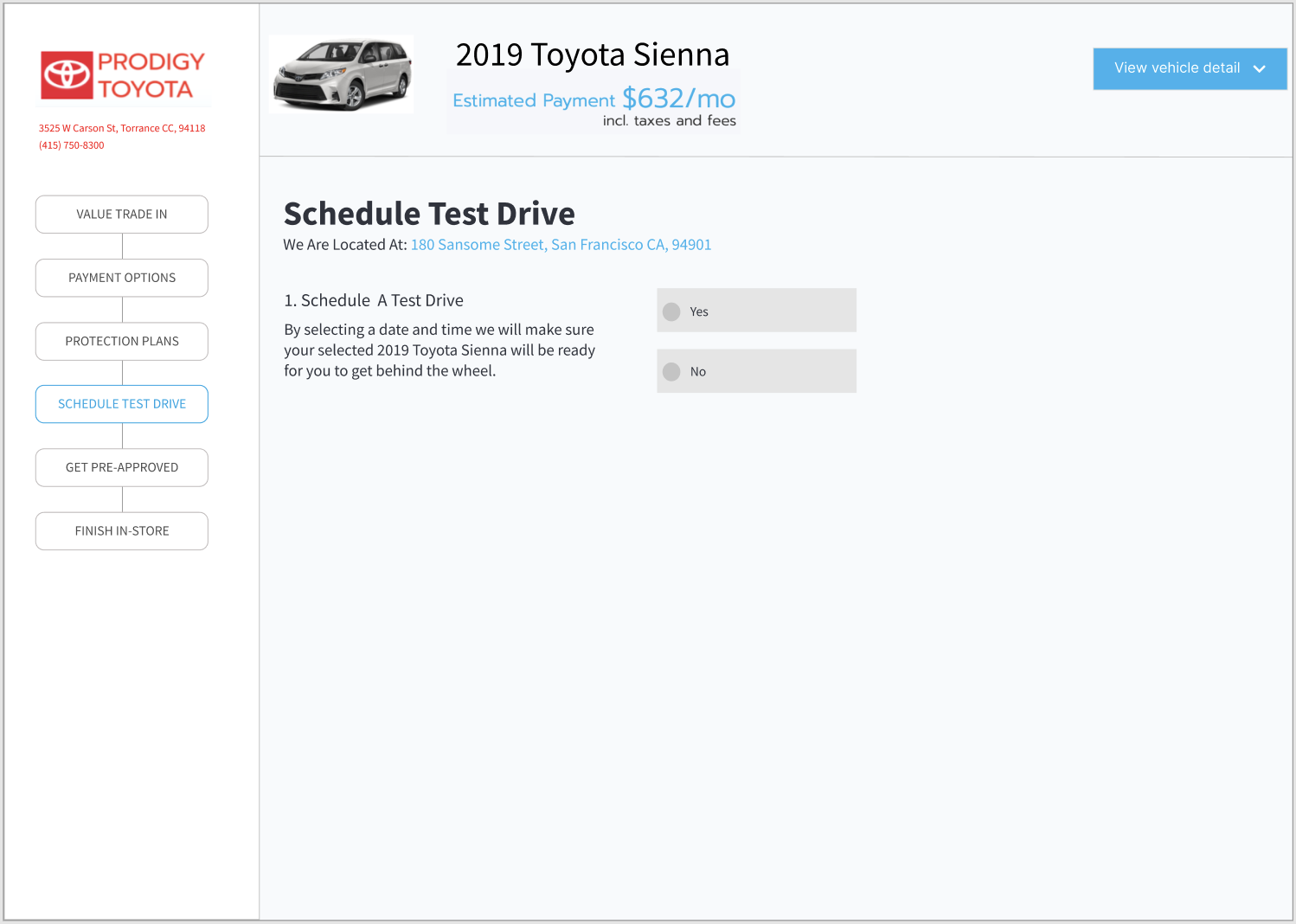
After
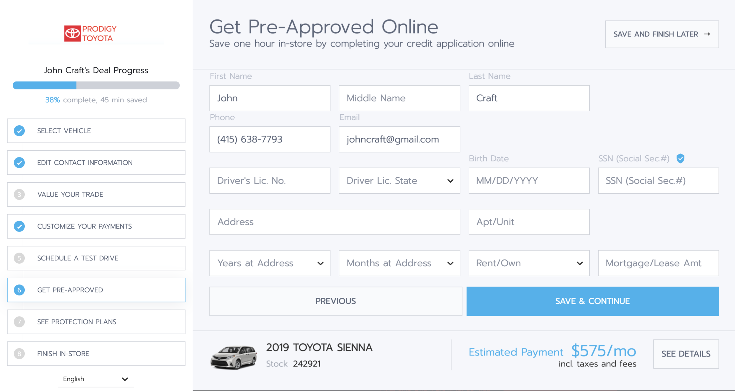
Pre-Approval Page before

After
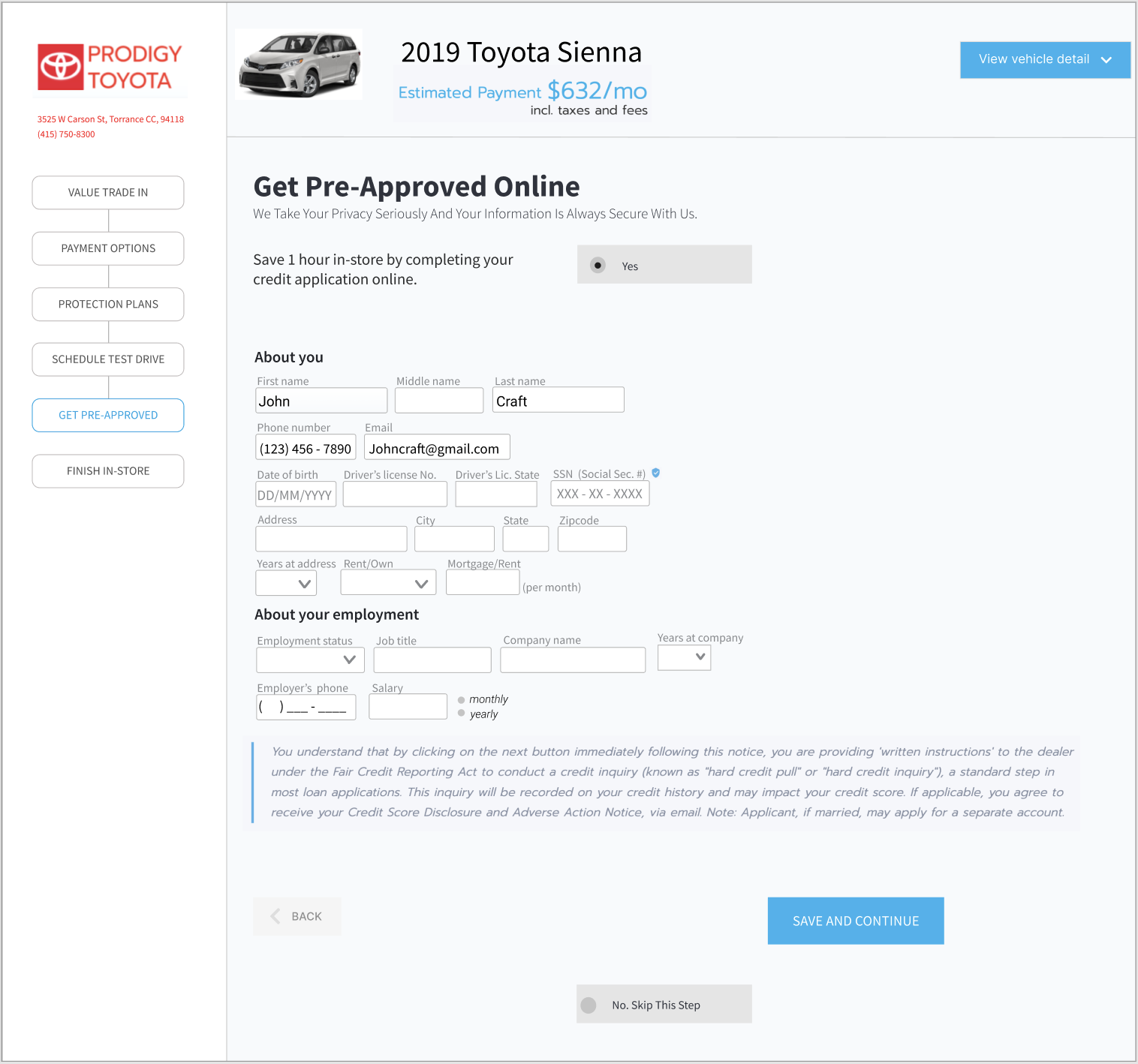
I split forms into 2 sections - About me and About your employment to make it clear

Finish-In-Store (last) page before
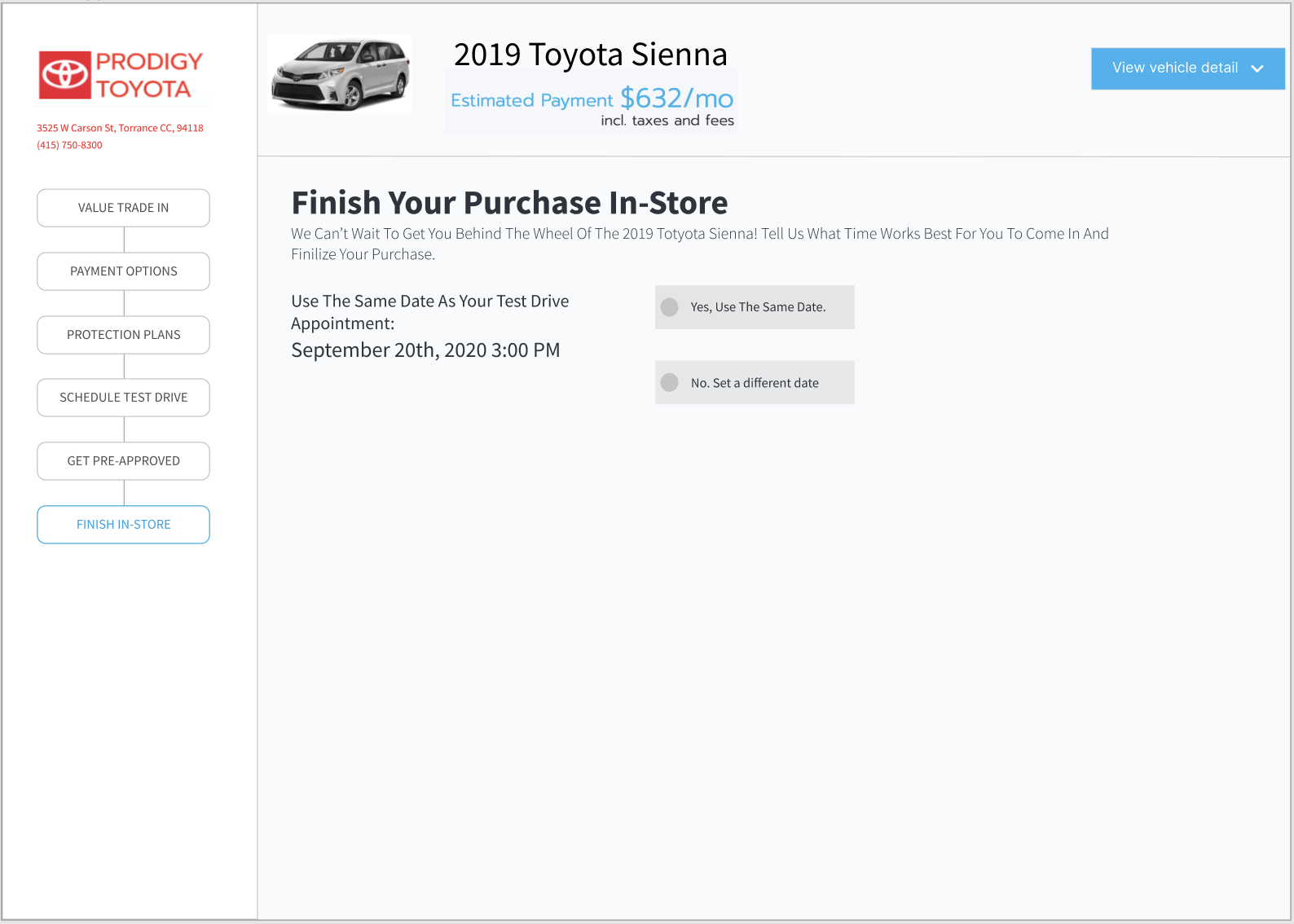
After

Confirmation pop-up window page