Discover hidden gems of San Francisco.
Concept project for non-profit organization SPUR to create a web tool about Privately Owned Public Open Spaces and promote the organization’s value to good planning in the Bay Area.

My Role
User Research, Competitive Analysis, Affinity Mapping, Persona Creation, User Journey, Prototyping.
Deliverables
The survey, Interviews, Contextual Research, User Journey, Persona Creation, Competitive analysis, Affinity Mapping, Usability Testing, Mid-Fidelity wireframes.
Tools
Figma, Balsamiq, Slack, Google Forms.
Challenge
At first, we were focused on creating a fixed folder on the organization's website, then we moved to an app solution and realized that even visibility outdoor signs would give an impact. But eventually, the team end up on mobile web design.
Possible solution
We designed an online search tool to provide individuals more information about POPOS, including photos, location, amenities, and contact forms as easy ways to get involved in the community. This would help establish trust and confidence in SPUR, increase awareness, and ultimately help people to explore the city’s hidden gems for much-needed outdoor exercise during shelter-in-place order.
Process
How my team and I solved this was by in-depth user research on the targeted users to understand better about their experience exploring the POPOS and people’s behavior of why they visit certain places, how they stay updated, and how POPOS attracting them that helped us in designing this website to increase engagement about an important issue.
The solution
People need one place with a list of all POPOS.
People need to know what amenities are included in a particular spot in order to enjoy their stay.
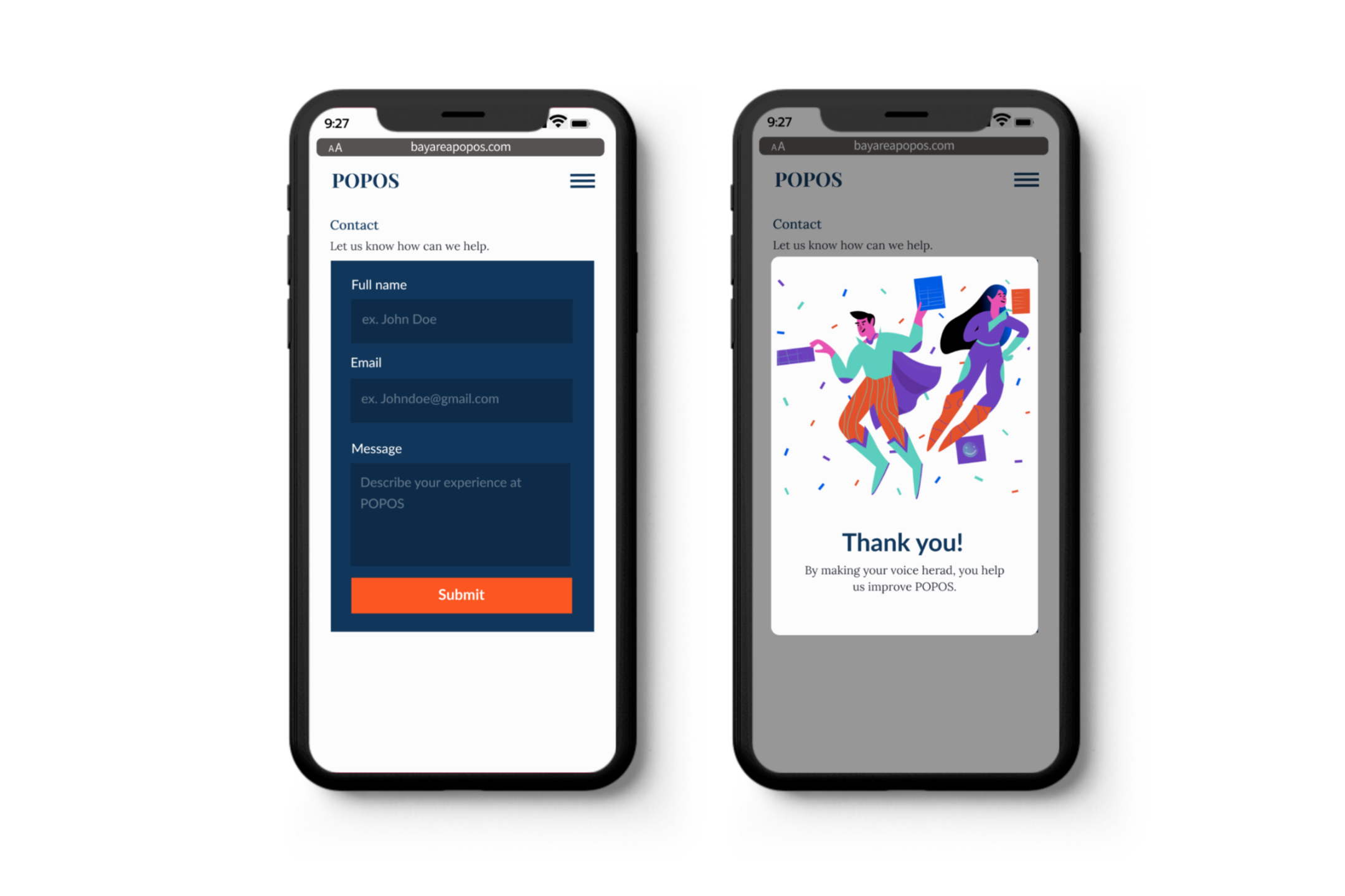
People want to know how they can be involved if they want to improve the place. Made the contact us page for user inquiries.
To better understand people’s experiences with POPOS we decided to see places first-hand, check if there YELP reviews on them, and conduct user surveys and interviews before diving into solutions.

Example of POPOS. Salesforce Park is the centerpiece of the SOMA neighborhood. The 5.4-acre elevated green space includes grassy lawns, public art is open for outdoor exercise.
It was a sunny winter day here in SF and our team of three designers went to discover POPOS first hand and watch people. It was quite an interesting walk, we ended up visiting 4 places. It was a prime time before the pandemic for Downtown - lunch, and surprisingly those places weren’t crowded. While some people were doing different kinds of activities like reading, eating, and sunbathing we took notes and we decided to explore SPUR’s website and check YELP reviews about POPOS.
Because SPUR is a leading civic planning organization at first we were focused on creating a navigation bar with POPOS that collects all information about these places. If you drive on the SPUR website, you can find more than 75 articles and links about POPOS, they even created a PDF map guide. SPUR understands that Open space is a significant need for the neighborhood and held regular meetings with SF Planning departments with recommendations for improving these important plazas, parks, and gardens for public use. To better understand people’s experiences with POPOS we decided to conduct user surveys and interviews before diving into solutions.
Survey
To find out if people have been to privately owned public open spaces. We conducted a survey with 35 participants with Google Forms and distributed it in a chat group in Slack.
Have you been at privately owned public open spaces?
Conclusion: We found that there are two types of people - regulars and uninformed users.
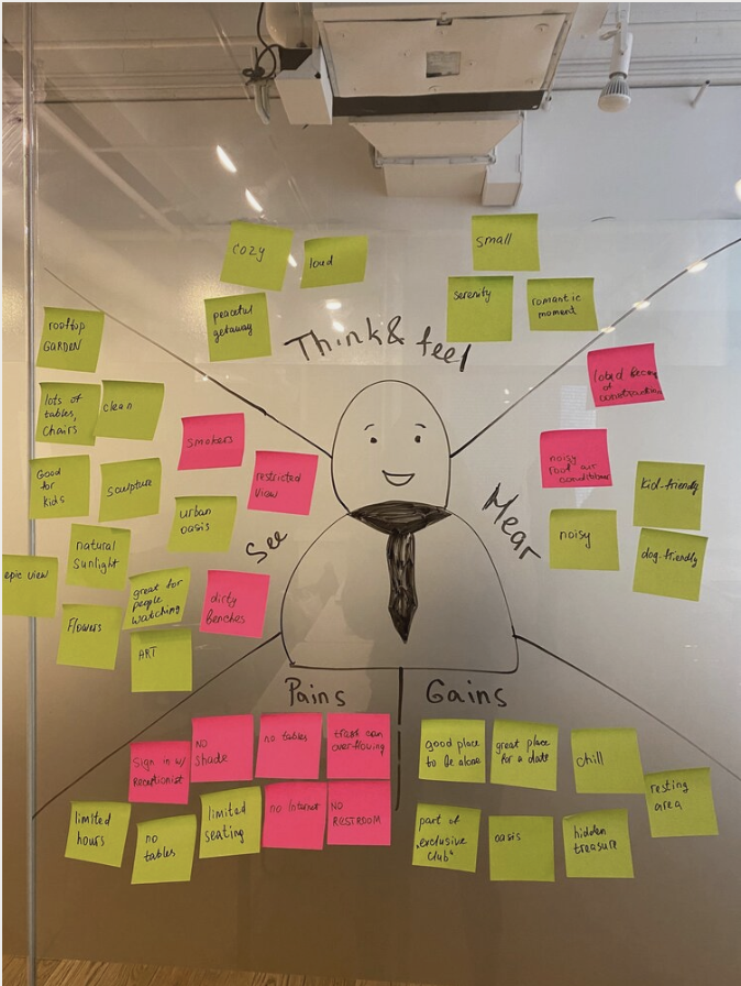
Affinity Map
Led us to two types of users - Regular and Uninformed users. Who are we really designing this website for? We used affinity mapping to synthesize the data collected through user interviews and secondary research. An affinity board helped us identify patterns among the target users. Through our research, we found two types of primary users:
Regular - who already know about the POPOS:
Uninformed user - who don’t know about them, have been there and wasn’t aware of it.
Therefore, eventually, we focused on the more common persona. Focusing on a specific user helps to keep the user’s needs in mind and not get distracted whenever an idea for a new feature or demand pops up.
Conclusion: We decided to create our primary persona, Karen.
Persona
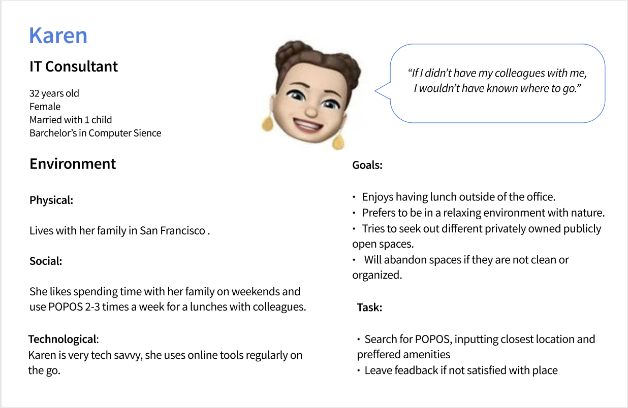
We focused on the more common persona - Karen to develop a solution that reflects her pain points and frustration.
User Journey
We found out that Karen feels frustrated in the research phase and feels positive after the experience. She clearly needs help to find the next place for lunch with colleagues.
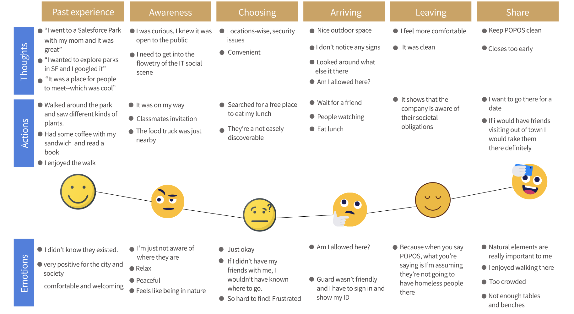
Thoughts include all the things which are going in the user’s head about the POPOS.
Actions represent what the user is doing at that particular stage of the journey.
Emotions are to capture the predominant mood of the user as he moves from one stage to another.
Conclusion after user research phase:
The goal is to have lunch or coffee with coworkers in a clean space.
Prefers to be in a relaxing environment with nature and a seating area.
Find POPOS through recommendations from people, who have been at POPOS.
Don’t have recourses to find other POPOS.
Will abandon space if it’s not clean.
What is out there?
The competitive analysis gave us an overall layout of the park’s websites and how they structured amenities and location preferences.
The purpose was to learn about the design and gathering inspiration from other mobile responsive websites with the listing. The most important takeaway from this activity was learning how different websites organized their park/place selection and the overall layouts they used for those websites.
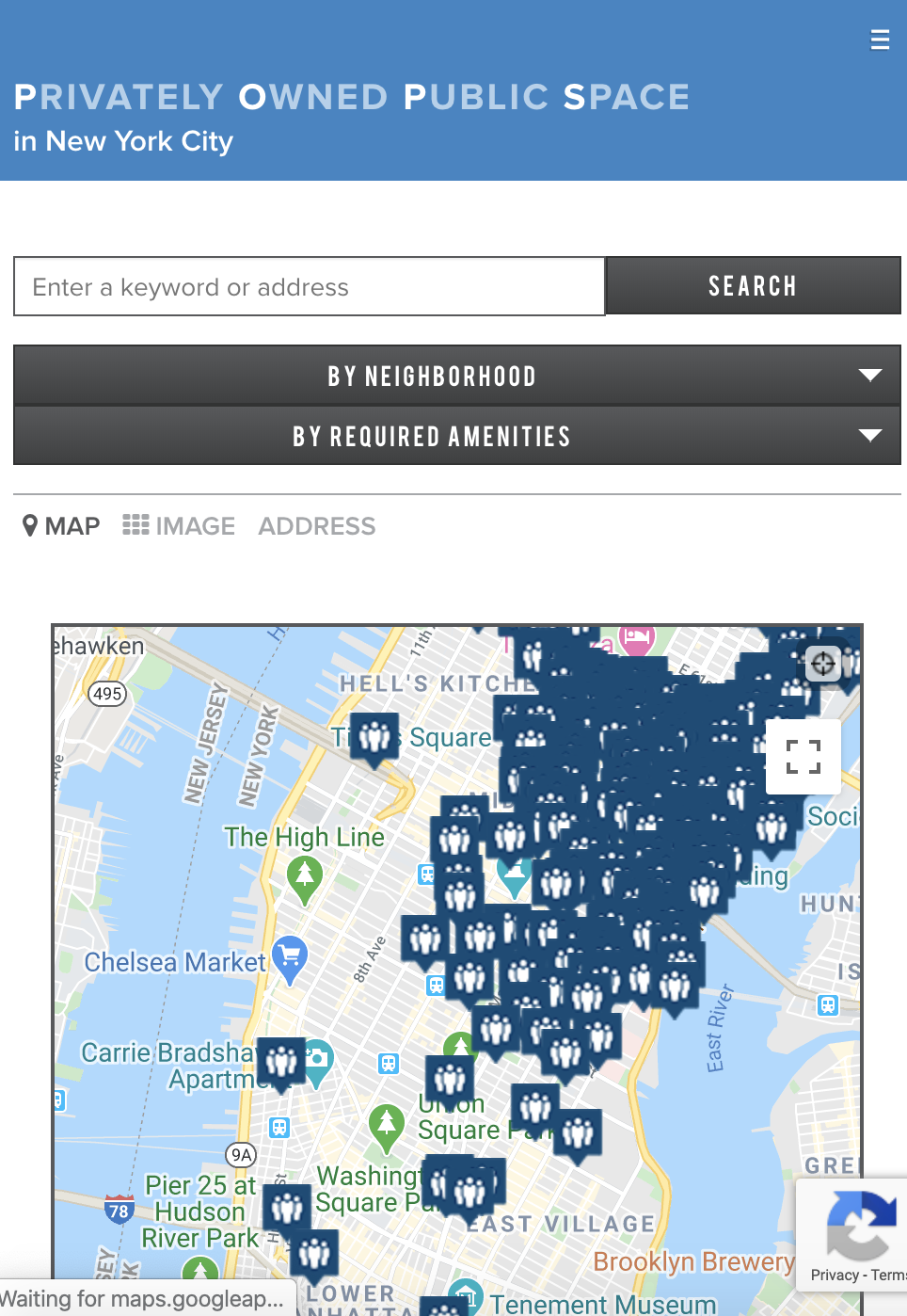
NY POPOS
The history of privately owned public space commenced in New York City and we looked at the NYC POPOS website.
We like the idea of how they prioritize features like search form, location, and amenities filter.
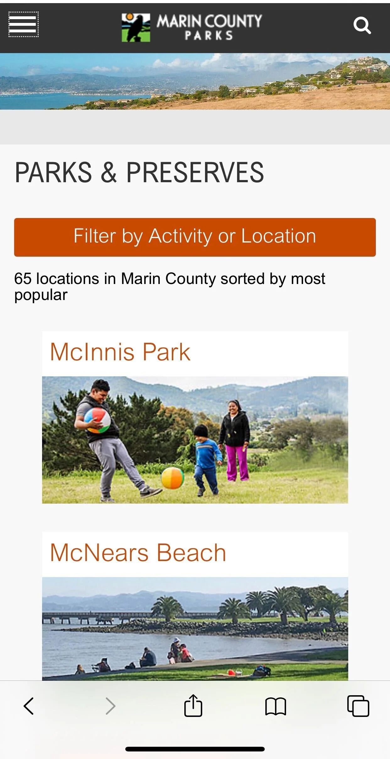
Marin County parks
Make it easy to quick and easy to find park using mobile phones.
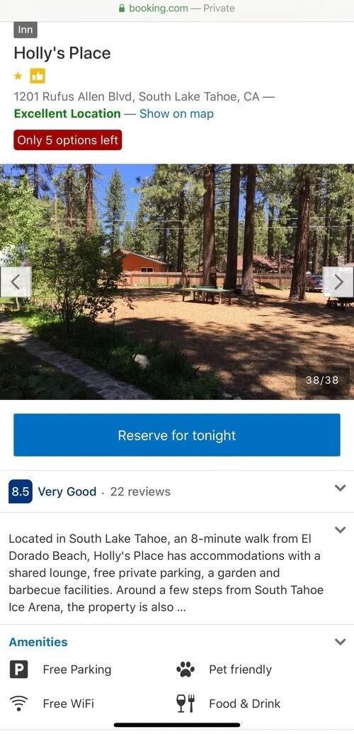
Booking
The simplicity of the hotels with a short description and list of amenities.
Ideation
From our research we knew that the user is looking for location and amenities, check photos, and would leave feedback if not satisfied.
With our research findings and personas in mind, we started to brainstorm solutions together. We decided to come up with as many ideas as possible without considering feasibility at this stage.
We then went through the ideas and discussed their implementation feasibility. For example, creating a navigation bar about POPOS on the SPUR website seems to be an excellent solution; however, in our survey, we learned that people found POPOS through Google search and word of mouth. No one ever heard about the organization and we moved to another possible idea - create an app. But to build a website seems like a huge step for SPUR and we decide first to create a website. And if it will be useful for users we would suggest creating an app after website testing.
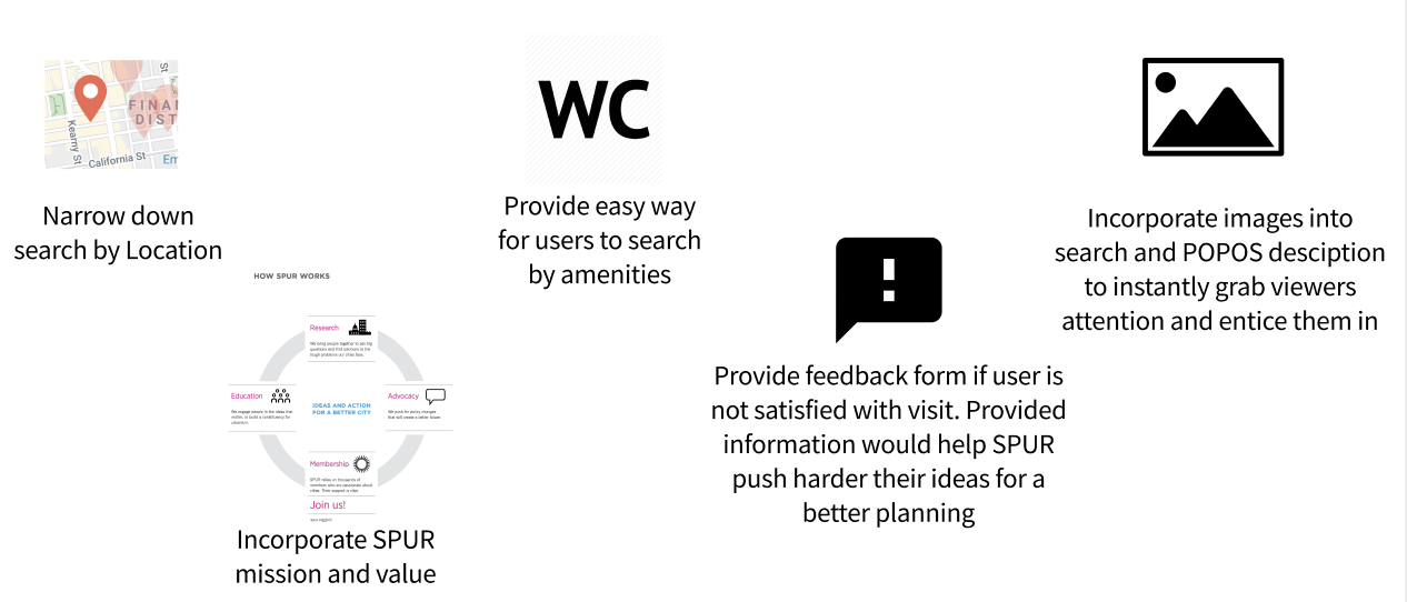
Eventually, we settled on the following core functionalities:
Core features
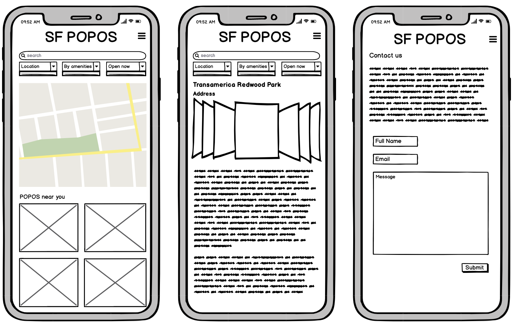
Prototyping
Once we organized all insights from the user research phase, the team began to design the mobile website because our user is on the go and prefers the phone for search. To start this process we began prototyping on Balsamiq the site’s main screens, “product category” page, and “Contact us” form. This allowed us to quickly explore the concept for the mobile layout.
After prototyping, the team conducted user testing of the mid-finality prototype with 3 participants, which helped us to reveal errors and areas for improvement. Based on the initial usability test findings, as well as my own considerations, the following changes were made in the next iterations of the prototype:
Usability Testing

Conclusion:
Landing Page
Simplified the search field to decrease cognitive load and provide a cleaner look.
Removed places based on location, because most of the POPOS are concentrated Downtown.
Filter
Removed icons in amenities filters for a better understanding of them.
Feedback Information
Added more information on why SPUR is collecting user’s feedback.
Menu
Reorganized and grouped menu items for better categorization.
Increased menu font size.
High-Fidelity wireframes
To address pain point 1: Quickly find a nice place for lunch with colleagues.
And pain point 2: Ability to leave a message. Many users raised concerns about cleanliness and don’t know where they can send their concerns and suggestions.