Marin Mommies App
With an idea to redesign one of my favorite websites, I ended up creating an app prototype.
Challenge: Changing the course from redesigning the website to creating an app.
Deliverables: User research, personas, user scenario, wireframe, prototype.
Role: UX Designer.

Overview
Target user: Adults ages 30–45 years old are tech-savvy and constantly looking for family activities with their kids.
Market: Parents and families in Marin County, CA
Problem: Launched in 2007, Marinmommies.com is a trusted resource for an average of 80,000 monthly visitors but hasn’t been updated for years and their content wasn’t irrelevant and not arranged in a user-friendly hierarchy. My challenge for this project is changing the course from redesigning the website to creating a new app prototype.
Solution: Create a go-to-guide tool for parents in Marin that connects them with the local community and introduces them to virtual events and places catered to their interests and helps to keep kids occupied especially while staying at home thereby providing a sense of belonging.

User research
To get more qualitative data I prepared a remote survey with 9 participants and distributed it among multiple parents on Facebook. This research was focused on the following open-ended questions:
• How often do you use Marin Mommies website?
• How many children in your household?
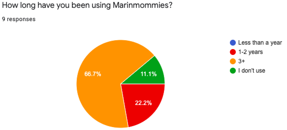
• How long have you been using Marinmommies?
• What’s your preference while looking for family activities?
• What are your 3 favorite topics on Marinmommies.com?
• What do you use the Marinmommies website for?
Key insights:
• Parents are looking for activities/events for kids to plan weekends ahead.
• Majority of participants use Marinmommies for more than 3 years.
• People are more likely to read additional info such as price, location, details regarding events, camps, or summer programs.
• Consider nannies and grandparents as a target audience.
• Data shows that 6 out of 8 people use the website 3-4 times a week which means they’re regular’s and always looking for new articles.
To better understand my user and the specific frustrations that they faced, I remote interviewed 5 users within my target audience. I created a set of questions geared at understanding the “why” behind their current behaviors. I wanted to understand their wishlist areas of improvement, specific frustrations, and how this process can be made easier? Example questions:
• Do you plan your weekends in advance? How far in advance?
• Who is responsible for choosing kids or family activities?
• How do you find family activities? Kids classes?
• Describe what it looks like when you plan your family weekend?
• What is important for you when choosing one?
• How would you describe your search?
• What are your preferences while looking for family activities?
• What app/tools do you use when looking for this purpose?
• Think back to the last time you visited these apps or websites. What features were most interesting to you, and why?
• Have you heard about Marin Mommies?
• If yes, how often do you open the website?
• How long have you been using MM?


From these questions and from wading through the responses that I received, I gained valuable insight. I learned of their specific behavior, the roadblocks that prevented them from successfully family planning, and which areas of the process they wished they could improve.
Key insights:
• Parents are constantly looking for activities/events for kids;
• Most preferred choice: Google and word of mouth;
• Search can take weeks through a competitive market.
• People are more likely to read additional info such as price, location, details regarding events, camps, or summer programs.
• Need something not COVID-19 related content.
• Users need additional info such as price, location, details regarding events, camps or activities.
Pivot
At the time, my idea was how could I improve the overall UX of their current website and create a positive user journey that aligns with their existing business strategy. What I realized that most users don’t have frustrations with the website and that bugged me. That gave me the idea of creating an app. I remember when I was looking for a weekend getaway at Marinmommies and sometimes it takes longer to find it and browse the page. Marin mommies have more than 100,000 monthly views and 80,000 people visits per month and I think this app can help parents to navigate in the neighborhood, connect with local businesses and find parents that struggle through the same problems.
Rather than always typing Marin Mommie’s website in the browser, it will be much easier to have an app and save the favorite topic, therefore have much quicker access.
Instead of creating a space where parents can connect with one another but Developing a platform to help local families share stories and experiences.
Developing personas
The results of my survey and interviews suggested that there were several types of users with diverse needs. The accumulation of the different insights and common patterns that came from the users’ answers helped me create three personas which are the manifestation of that data in a character. Two of the personas presented edge cases since they were based on certain needs of some of the participants. Therefore, eventually, I focused on the more common persona. Focusing on a specific user helps to keep her needs in mind and not get distracted whenever an idea for a new feature or demand pops up.

User Scenario
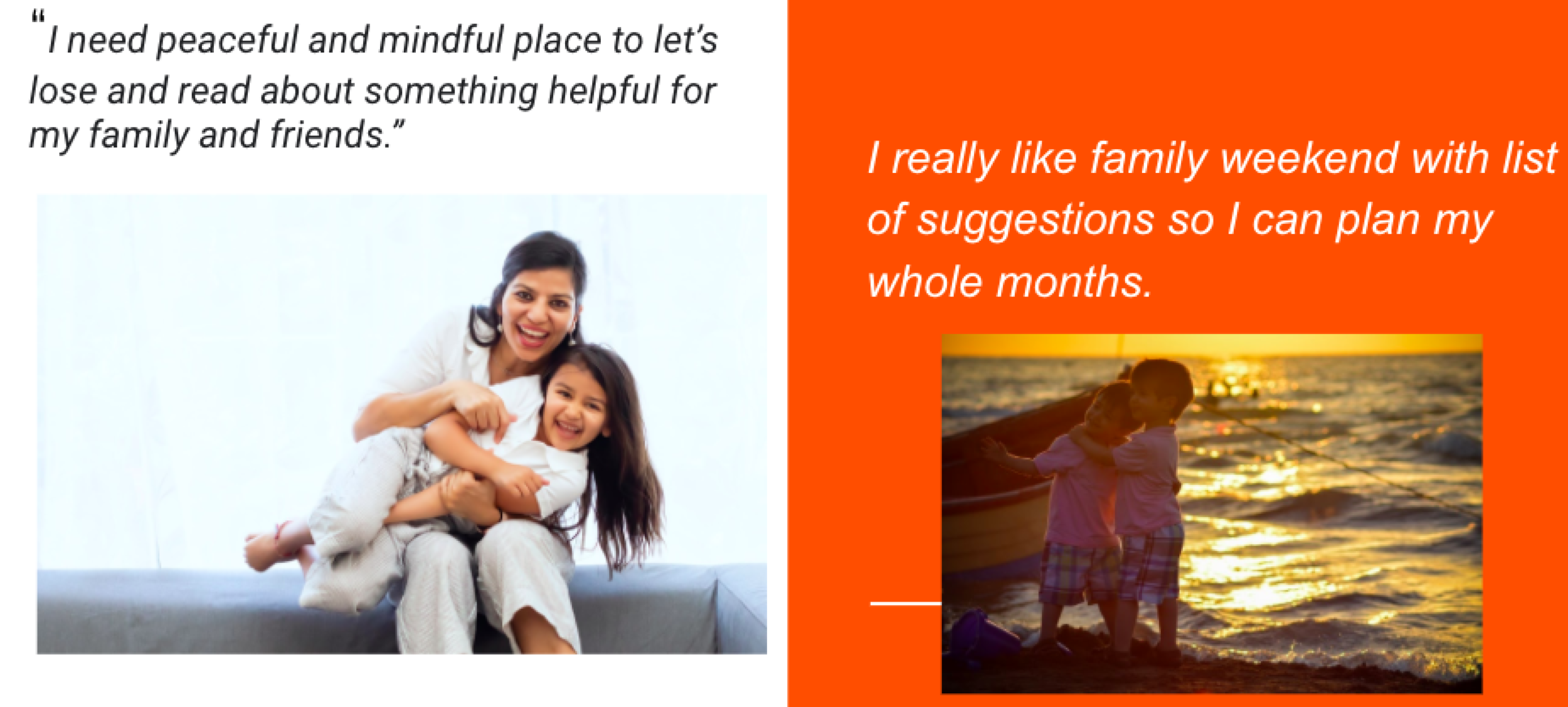
Anna’s family is having dinner and they want to keep their daughter Ellen busy during shelter-in-place order and goes to a Marin Mommies app to find out what’s school is available nearby. She found Tutu school and they drive there to register their daughter. After all, Ellen loves her class and her parents are happy with the choice. They find the Marin Mommies app very useful and happy to have everything family-related in one place!

User flow
Next, I constructed potential User Flow to illustrate detailed steps and complete paths that users would follow within the app to achieve their goals in the most seamless and satisfactory way. This stage also helped me to map out MarinMommies desired pages and functionality.

Anna is looking for a dance club for her daughter and through the landing page, she can navigate to a category named “Classes” and find desired activities with details such a location, info, and contact.
Low-Fi wireframes
Rough sketches, brainstorming different solutions & ideas for user flows and app features.


Mid-Fi wireframes
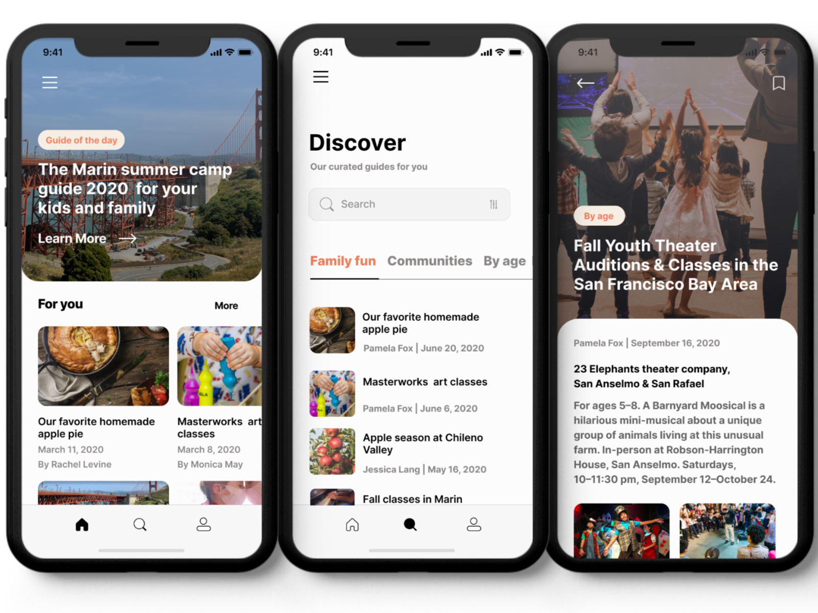
To get started with the layout of screens for Marin Mommies., I made quick sketches and jotted down the key ideas and features I wanted to incorporate in my app. These were helpful in figuring out the visual hierarchy of information on each screen. I changed and revised several aspects in future iterations, nonetheless, it gave me a good initial idea of Marin Mommies.
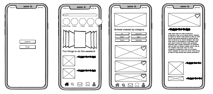
Screen 1 - Splash Screen Screen 2 - Home page Screen 3 - Category page Screen 4 - Subcategory
Usability testing
Positive feedback
Participants had a fairly straightforward experience using Marin Mommies
Most participants said they would use Marin Mommies to explore Marin County
Participants liked to see the saved articles & found them to be useful
Negative feedback
They found the search button is not visible and would like it to be upfront.
Participants had a hard time locating the “Forum” page because of its misleading icon
The category section needs to be visible without scrolling to the right
Participants want to be able to sign in without Google and Facebook accounts because of the lack of privacy.
Home screen iterations

Improved the Home page by adding a hero image and text that will clarify, at a glance, that the site provides information about local family guides. Highlight the “Guide of the day“ button and add a search button instead of “Saved”.
Discover page Iterations

Differentiate topics of the blog and give users the power to control content and save guides.